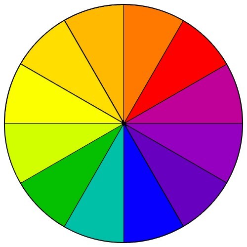
In today's article I'll cover how to choose a color scheme for your website. You may not know it but each color conveys a psychological meaning or feeling. So when you look at certain colors you automatically associated them with something in your subconscious. When building a website it's important to keep this in mind. Choosing the wrong color scheme may stir up thoughts or emotions that are contradictory to the message you're trying to convey while choosing the right color scheme can re-enforce your message. So let's dive right in and explore the meaning of some of the most common colors.
White.
White is not typically thought of as a color but it plays an important role in web design. You've obviously heard of "white space" for example. Having plenty of white space on your website makes your content easier to read and by adding white space around things like the headline of your page you're drawing extra attention to it.
If you want the contents of your page to be read the best choice for a background color should be white. Nothing is easier to read than black text on a white background.
From a psychological perspective white commonly conveys feelings of innocence and purity. Think for example about a white wedding dress. White is a clean color -- it breaks through the noise and the clutter of a page. White works well in e-commerce when compared to darker color because it's light, bright, friendly, and says "I'm not going to scam you".
Black.
Black pretty much conveys the opposite of white. This means it's commonly associated with things that are dark or sinister. If you're considering selling something on your website I wouldn't recommend a black background. It will make people feel like perhaps they cant trust your website.
There is a time in a place for black however. Because black provides great contrast to things of color it's a terrific backdrop to show off photos, paintings, or other works of art. So if you have a website that's not necessarily focused on selling artwork directly from your website I would recommend a black background.
Red.
Red puts people on high alert. It's typically associated with things like warnings. Red is such a vibrant color it can really grab people's attention. I like to use red to indicate there's a sale or something I want a site visitor to notice on a webpage. Red can also convey feelings of romance or love. So there are times where you may want to use red in your color scheme to connection with people in that capacity.
If you choose to do red you probably don't want to over do it. In summary it makes a nice accent color and is a real attention grabber but make create uneasy feelings if over-used.
Blue.
Blue is a great color for webpages. Blue is typically associated with trust and loyalty. Blue can also represent things that are cool or cold. If you scour the web you'll find a lot of websites that have color combinations of white and light blue. This is a very pleasing color scheme for people to view and is easy for people to feel comfortable with.
Different shades of blue can convey different messages. Darker blues are more authoritative for example while lighter blues are softer.
Blue text is usually an indication something links to another page. So keep that in mind when choosing whether to make your text blue. You don't want to confuse people by making your text the same default blue the browser uses to indicate a hyperlink.
Green.
Green conveys thoughts and feelings that have to do with health and/or the environment. Think about the way you see green used with packaging in the grocery store. Many time it's used for products that claim to be reduced calorie or low fat.
Green also represents the environment. Trees, plants, and grass are all shades of green so it makes sense we'd think about the outdoors when we think of green.
Green is a cool color and so it's a good counter balance to warm colors like red, orange, or yellow.
Yellow.
Yellow is one of my least favorite colors for the web. If you use yellow text it will be difficult to read regardless of the background color you choose. So avoid using yellow text for any reason. You can use yellow to highlight text on a white background.
Yellow is a bright and cheery color -- and conveys positive feelings. It's also one of the three primary colors so when used in conjunction with red and blue (the other two primary colors) it can convey a fun and simple message. That's why primary color schemes are so popular with toys.
Brown.
Brown is an earth tone. Similar to green it can convey environment or organic. Brown is considered a warm color so it's counter balances would be blues and greens. On the web brown can be a nice, warm alternative to black for a background. It's a utilitarian color and isn't considered to be pretty by most.
I could spend more time digging into every color of the rainbow but now that you're thinking about the meaning of colors I'm sure you're well equipped to choose a color scheme for your website. If you get stuck just think about how colors are used in marketing all around you in everyday life. There you should find plenty of inspiration.
