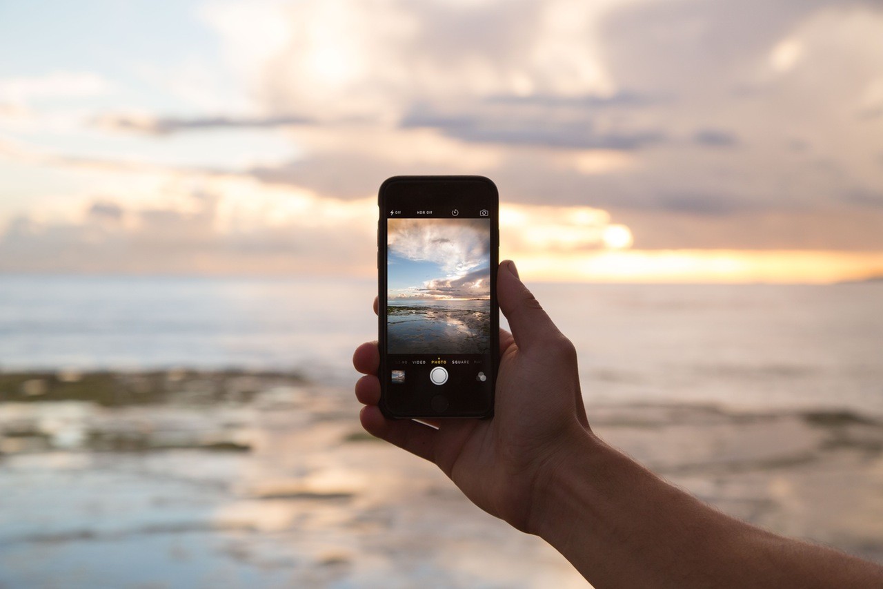
1. Make sure the lens is free from fingerprints and debris.
When I see people take photos with their smartphone this is the most common mistake. They take it out of their pocket, point, and shoot. We don't treat our phones like our cameras. After several days of bumping around in a purse or pocket, and being used for everything from phone calls to playing games, you've usually put fingerprints all over the lens.
Do yourself a favor and wipe the lens clean just before taking a photo. I like to use a clean part of a soft shirt or a microfiber cloth if you're prepared. A clean lens will result in crisp photos without that foggy look.
2. Stabilize the phone for a crisp shot.
Just like human eyes need to be still to focus, so does your camera's lens. That's why we still use tripods. There are several small tripods on the market you can use with various cell phones and they work great. If you're like me and you forget to pack your tripod try finding a place to rest your elbow while taking a shot. That should provide enough stabilization to avoid a blurry outcome provided you have enough light.
3. Make sure the light is at your back.
Speaking of light, make sure you have plenty of it. And make sure the light is coming from behind you as opposed to in front of the camera. If you shoot directly into light your camera is going to try and compensate for it either by generating an image with dark subjects or by a hazy and foggy look. To take the best photos you should have plenty of light coming from behind you and illuminating the subject.
4. Make the main thing the main thing.
When taking a photo think about what compelled you to take it. What is the subject of the photo? Is it a person? A specific feature of scenery? By aware of what you're including in your shot and be sure to make the primary subject the most obvious thing in the photo. It also helps to eliminate things from the background. For example, many times I want to capture a stunning landscape but need to position myself to cut out unnatural objects like buildings, cars, and powerlines.
5. Use the rule of thirds.
Another thing that can help you make the main thing standout is using the rule of thirds. In simple terms imagine you're looking at the screen of your smart phone and taking a photo of your best friend in front of a gorgeous lake. The photo will likely turn out best if your friend is on the left third or right third of the screen.
With patience and practice along with following these steps you're likely to generate better looking photos for your website. To get those photos posted to your website be sure to read my article on how to get photos off of your smartphone and onto your website.
